_year 2017
_duration 2 months
The project: Creating a product in style of the Japanese brand MUJI. The basis of MUJI‘s product development is characterized by minimalist design, pure functionality and products that are produced as efficiently as possible. Their focus is on bringing pleasure to people and beauty in their lives.
The speaker is simple to produce and also to use. The interface is intuitive and understandable to every generation and age. The overall appearance peaceful, sturdy and minimalistic and thus able to blend in. Its functionality is reduced to one user-friendly button to turn the speaker on/off.
To further explore the form of the speaker, I started with prototyping. I bought a speaker and disassembled it to see what sits inside and how it is arranged within. With cardboard I made quick mock-ups of shapes to get a feeling of the dimensions.
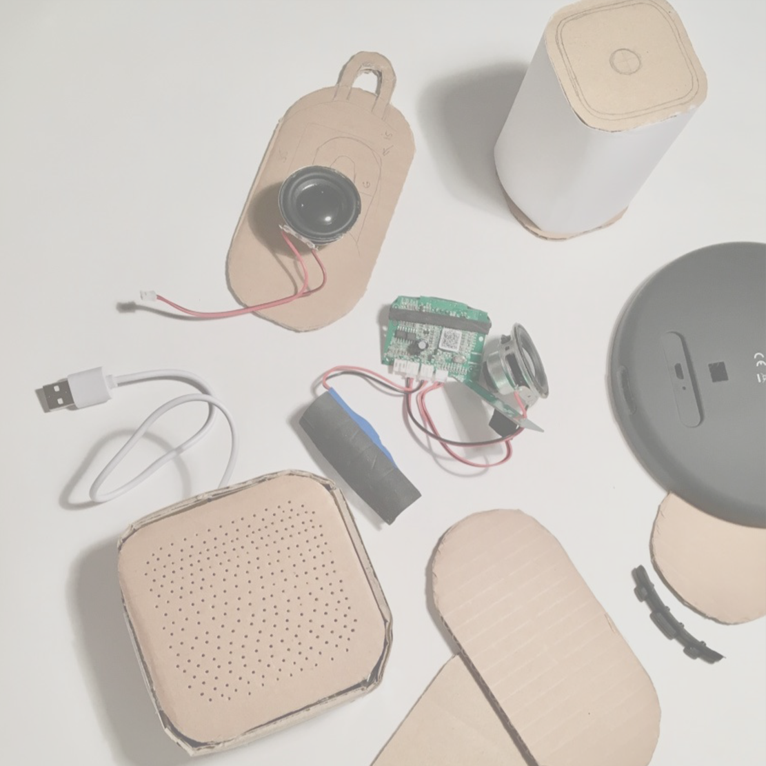

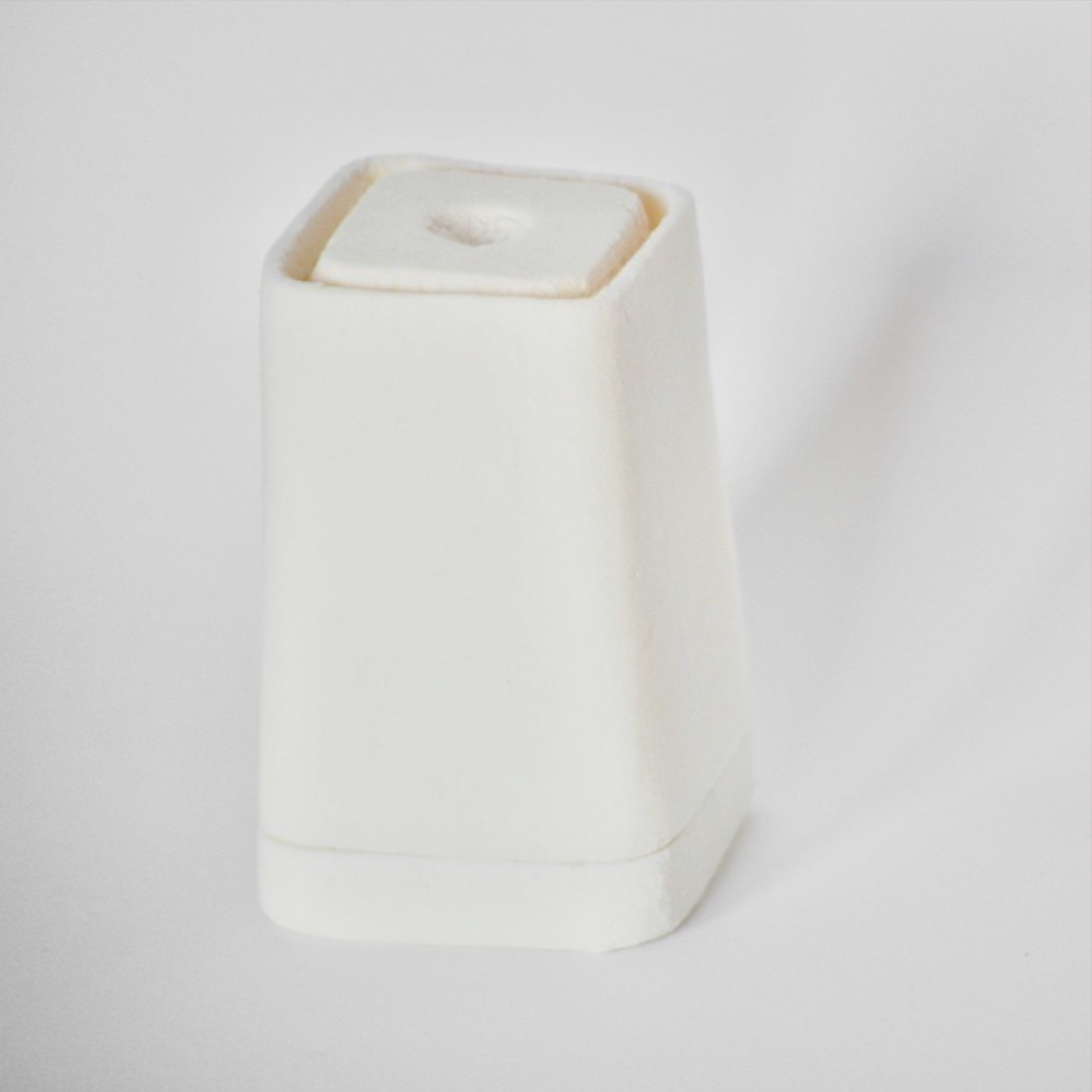
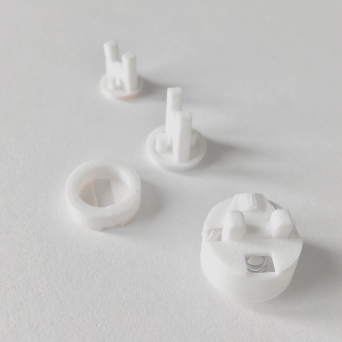
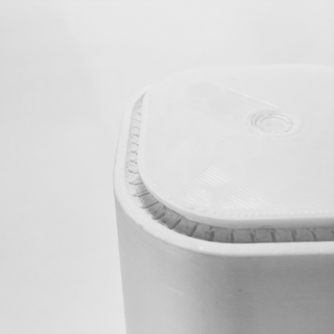


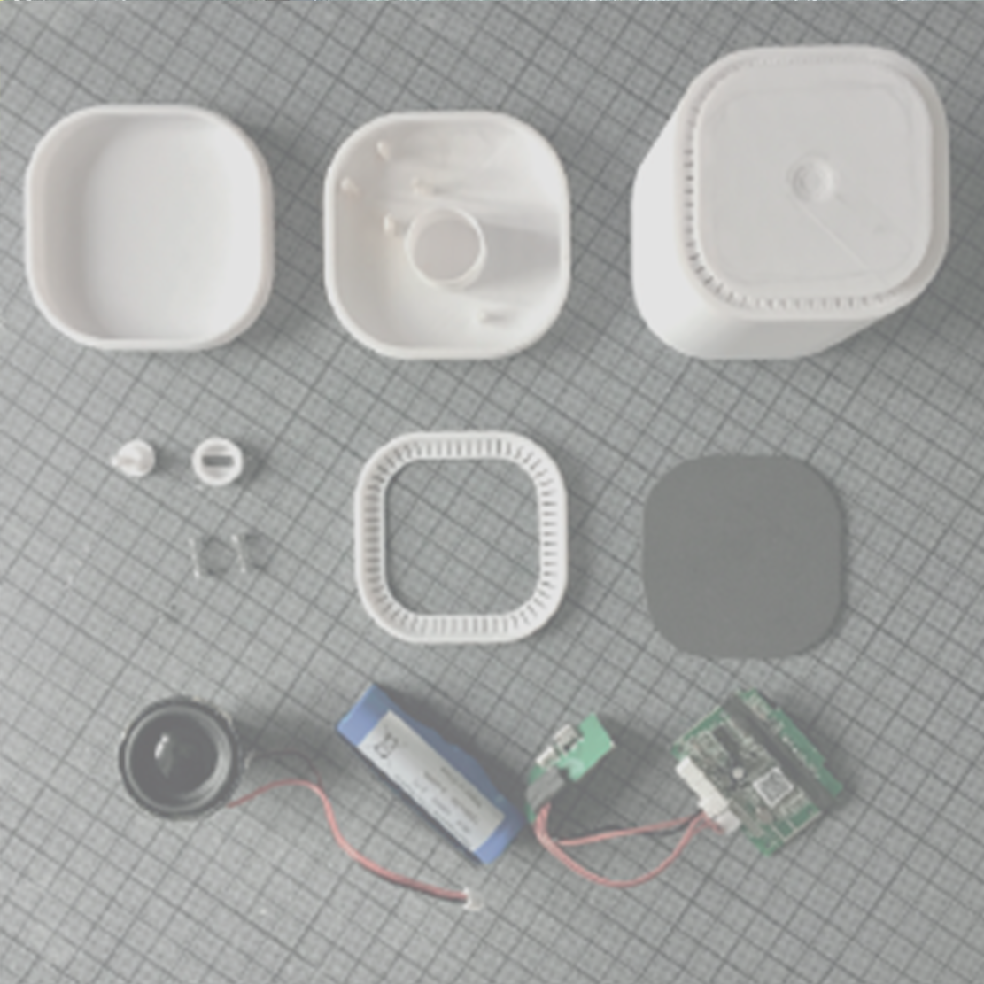
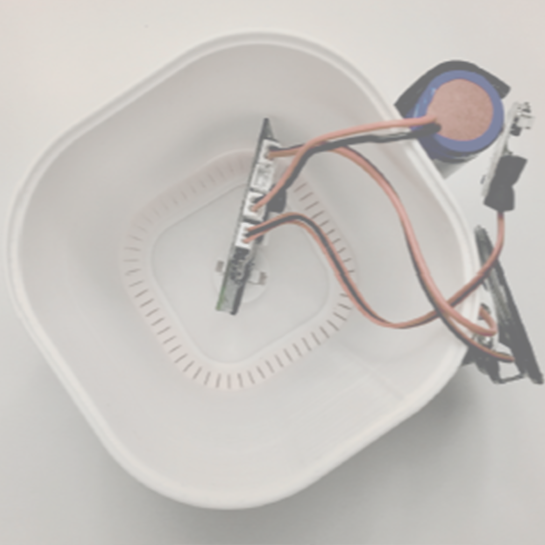
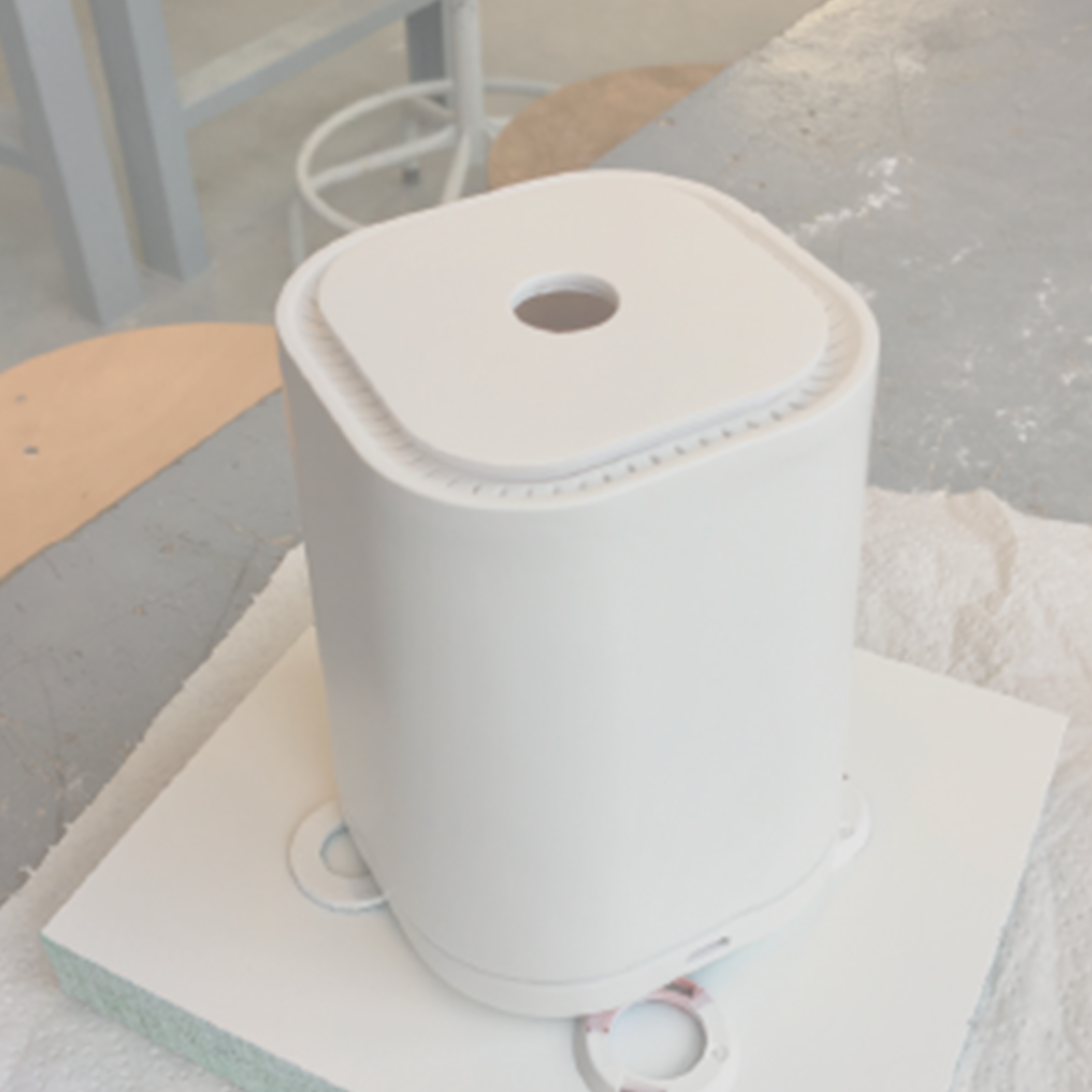
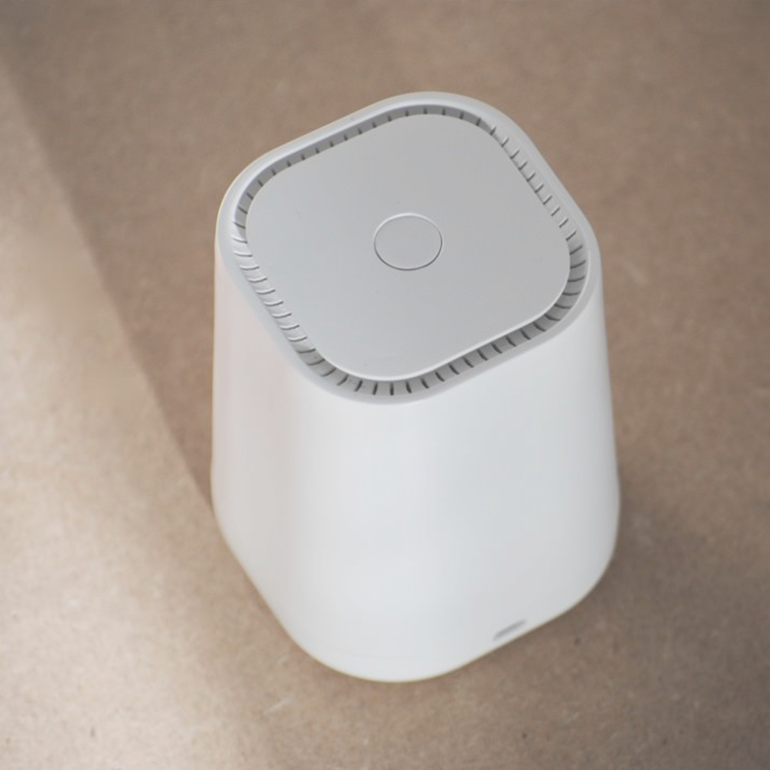
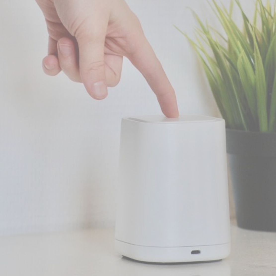
Afterwards, I had a rough idea of the speaker’s form and modelled it in CAD. I created prototypes out of foam and 3D- prints. The push-button of my functional prototype is made out of two springs of a normal pen. I had several trail and errors of buttons before the last one eventually worked!
White and sandstone are neutral and peaceful colours. The speaker does not have any branding, logo nor a colour highlight. It simply blends in and seems natural in its surroundings.
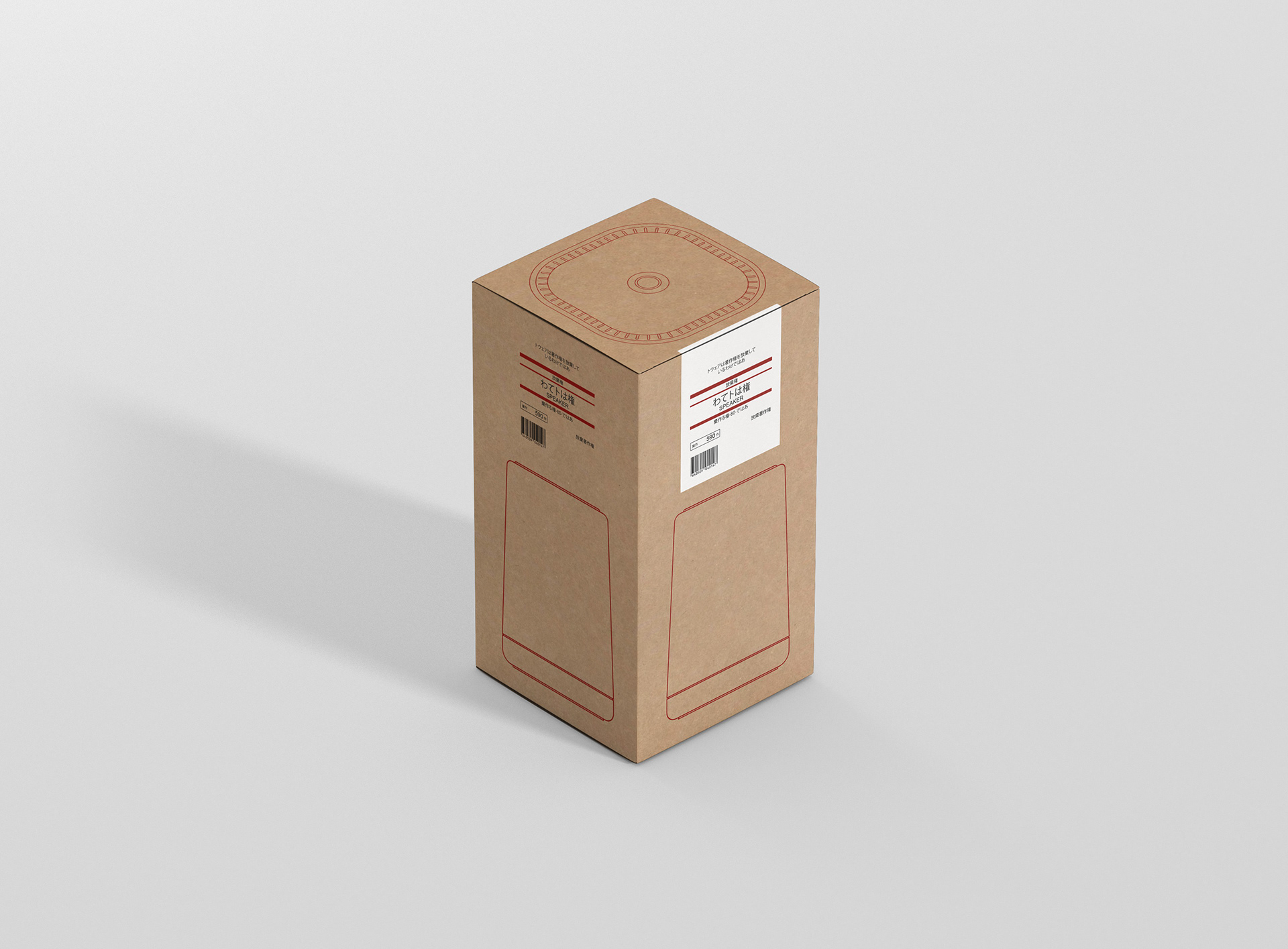
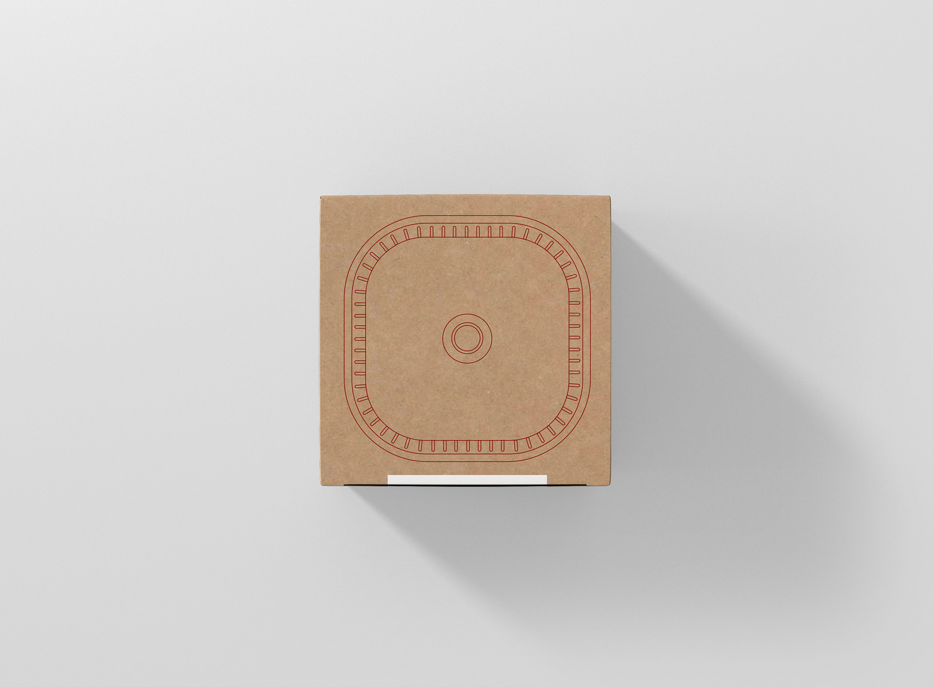
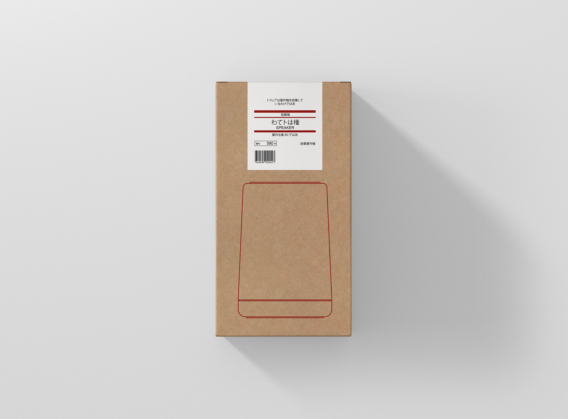
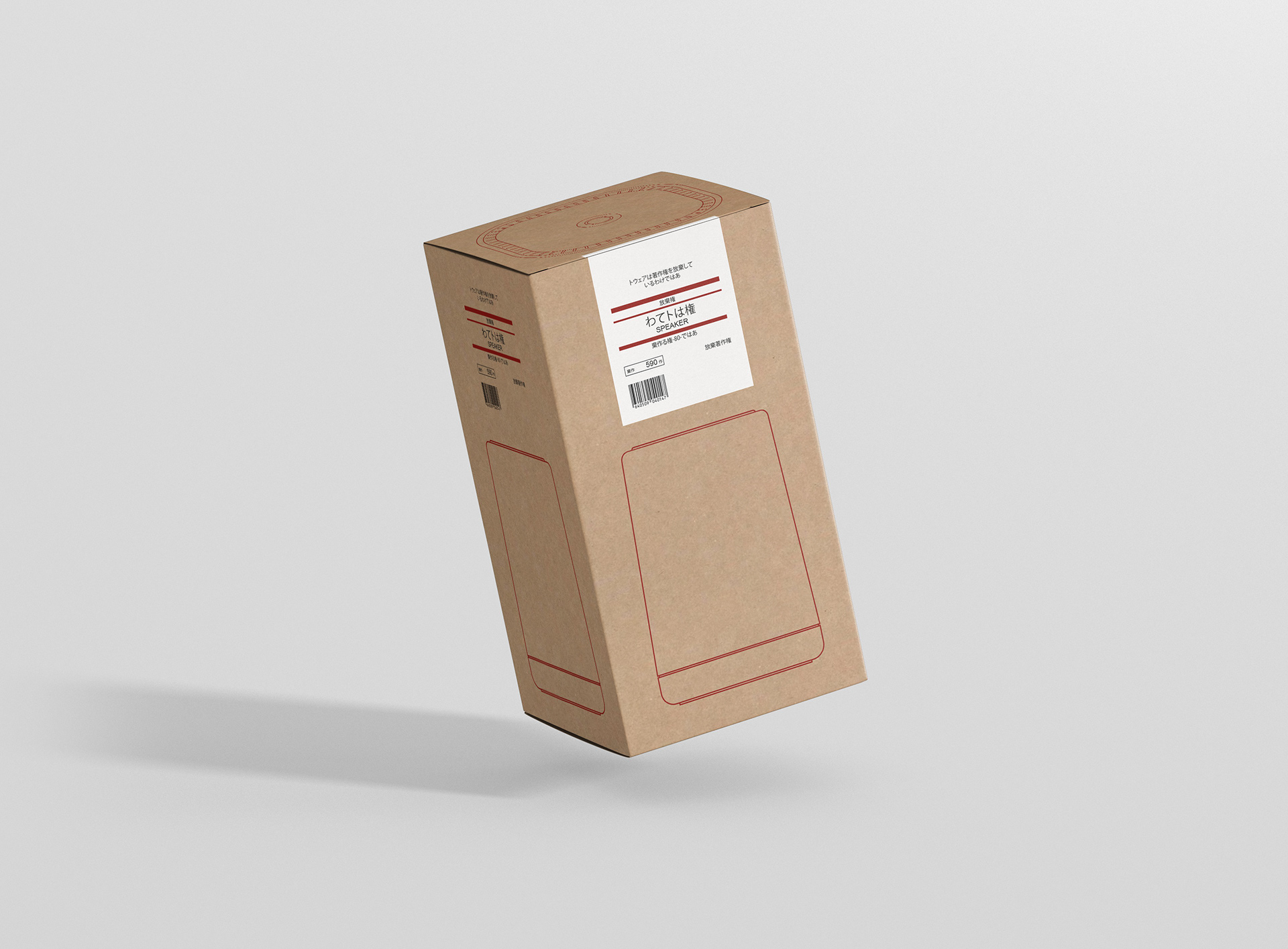
The packaging is simplified to the extent of bare minimum to emphasize the natural qualities of the product, and minimizing both cost and waste.
